
Introduction
A few months ago, I put together the first part of a guide to help people who wanted to start delving into that hard-to-pin-down brand of storytelling that we do at The Pudding. I was frustrated by the fact that finding sufficiently beginner-friendly resources was so difficult, and decided to collect the most useful links for jumping into data analysis in this blog post.
Today, I bring you the second installment of How To Make Dope Shit on The Internet; this one, aimed at helping ease some anxieties that people may have about designing visualizations.
Design and Data Visualization
Approaching the design of a visualization can be daunting: which insights of your analysis will you visualize? Which chart should you use? How will you code it?
The complexity of this chain of decisions can quickly become frustrating. Picking the right way to communicate data may be difficult enough on its own, but pairing it with code, especially when you’re new to programming, can seem exponentially more maddening. I get it — I’ve been there, and that uncertainty sucks. Below, I’ll provide you with a few thoughts on how to make this a little less anxiety-inducing, because at the end of the day, you’re doing cool, exciting work.
Look at visualization
To learn how to create something, you need to see what others who were practicing it before you were doing. Ernest Hemingway read the works of Shakespeare and Dostoyevsky; Picasso deconstructed the paintings of Velázquez and Goya. While we’re not in the same league, or even playing the same game, the core principle remains the same. In order to know what’s possible — both in terms of what to visualize and how to do it — draw inspiration from past pieces of data visualization that you’ve seen and enjoyed.
Internally, we’re always getting excited about work that our peers are putting out. Some of our most consistent sources of inspiration are:
- The New York Times’ interactives
- The Upshot
- The Washington Post
- Google News Lab
- The Guardian's interactives
- The r/dataisbeautiful subreddit
I’d also suggest you take some time exploring the archives of Kantar’s Information Is Beautiful Awards, which view like an encyclopedia of some of the best-designed visualizations in the past several years.
Another terrific resource is Andy Kirk’s Visualizing Data, which contains a massive monthly archive of his favourite visualizations.
Archive the work that you like
I frequently come across data viz work that I admire, either due to the clarity of its message, the aesthetic design, or certain subtle touches that solve visual problems I’ve previously struggled to overcome. Since you’re likely to be learning viz on the fly, either while you’re working on a technical project or in your spare time, it’s imperative to keep notes on the most interesting and impressive pieces you encounter.
To make sure that I remember the lessons to be gleaned from each of these, I save them to an ever-open Google doc. It’s as simple as taking a screenshot and adding it to the doc with an annotation of what I liked about it, and a link to the original.
Another option is to use Sightline, a tool created by Jordan Sechler and Evan Peck, which allows you to automatically save data visualizations you encounter online through a Chrome extension. In addition to automatically compiling your personal archive, you can explore the visualizations that have been saved by other users, which makes trawling for inspiration even easier.
Think about your message
Before you begin visualizing your data, think through the most important points that you’re trying to communicate. Is the key message the growth of a variable over time? A disparity between quantities? The degree to which a particular value varies? A geographic pattern?
Once you have an idea of the essential takeaways you’d like your readers to understand, you can consider which type of visualization would be most effective at expressing it. During this step, I like to think of the pieces of work that I’ve got in my archive and see if any one of those is especially suitable for the task at hand.
Other freely available resources are the Data Viz Catalogue or Data Viz Project, which give a long list of chart examples, alongside descriptions of the types of data they’re most suited to.
Don’t design in code
Once you’ve got a chart in mind, it’s time to design it out. Some people can sketch a few lines on the back of a napkin and jump straight to code, designing as they go (I’m looking at you, Russell). For most people reading this guide, however, designing on the fly in JavaScript isn’t a viable option: it’s too easy to get bogged down in bugs and syntax, going down StackOverflow rabbit holes rather than designing viz.
Instead, I’d recommend spending some time designing the static visualizations using a simpler tool. This will allow you to quickly get a sense of whether or not your visualization communicates the insights you’re hoping to express.
There’s no need for coding or fancy software, here. For years, Matt’s been drafting viz in Keynote, and quickly converted me to doing so after we began to work together. It’s surprisingly easy to create data-driven charts and fine-tune their design using Keynote’s in-built capabilities (shapes, masks, gradients, etc.), while keeping the learning curve sufficiently low and avoiding barriers posed by more powerful software like Adobe Illustrator (if you’re comfortable with Illustrator, bless your heart — go forth and design the hell out of your viz, but remember not to get too bogged down in detail). We've also recently started to explore Figma, a web-based design tool that makes it easy to collaborate with multiple team members and helps export CSS styles, and have been thoroughly impressed.
Happy with the viz you’ve designed, and itching to make it interactive? Let’s talk code.
Ready to learn to code, pt. 1: Read Scott Murray’s Book
There are very few resources for learning to code data-driven visualizations that are geared for beginners, and Scott Murray’s Interactive Data Visualization for the Web is one of the few that explains a sufficiently broad range of concepts to get you started with programming. I read his original book cover to cover, and can testify to the fact that it was an incredibly useful resource when it came to helping me understand both general HTML/CSS, and the way that D3, the JavaScript library that we use for data-driven visualizations, works.
Moreover, Murray does a terrific job of limiting the concepts he exposes his readers to, which helps beginners bypass the “Dear god there’s so much I don’t understand, EJECT!” stage. I can’t recommend it enough.
Ready to learn to code, pt. 2: Look at other people’s code
Ian Johnson, known online as enjalot, has created a wonderfully useful tool for browsing data-driven visualizations called Bl.ock Builder.
Want to put together a pie chart but aren’t sure how? Just search for “pie” and browse any one of the numerous code examples. Confused by how to use the d3.forceSimulation function? Search for “d3.force” and read through the code — most of the time, you should be able to find a code example that will help you get your head around the tricky concepts.
Ready to learn to code, pt. 3: Ask questions!
Sometimes, learning how to combine all of these skills can be a lonely endeavour, and it may seem like there’s no one around to help. In truth, the data visualization community is incredibly helpful and supportive.
If you get stuck, or just want to talk about coding and visualization with other folks in the same boat, the D3 Slack group can be a great resource.
For more pointed technical questions without the camaraderie, posting a question tagged with d3.js posts on StackOverflow is a quick way to clear up any technical ambiguities you’re struggling with.
Putting it all together
My hope is that the previous sections have helped with any specific design and coding questions you may have faced. Nevertheless, combining all of these steps to create a final output is hard if you’re not used to doing so. That’s why I’d like to leave you with a few examples of the fact that even for pros, design is hard, time-consuming, and iterative.
Check out, for example, this image that Scientific American’s Jen Christiansen tweeted out, documenting the numerous design drafts that her team produced to demonstrate the stages of pregnancy:
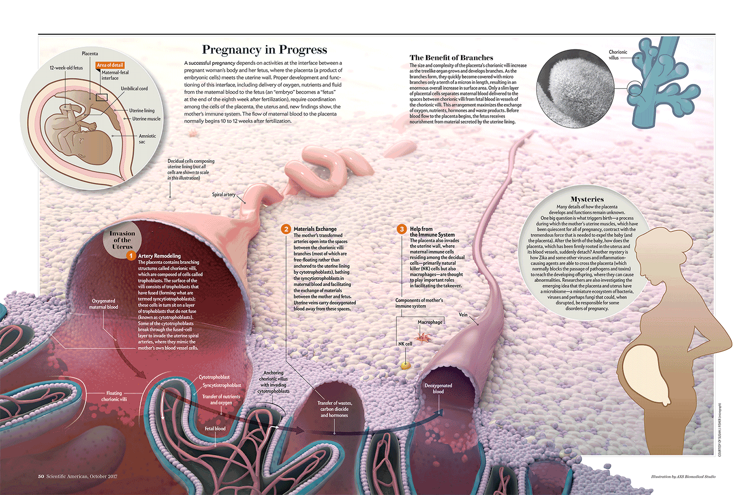
The evolution from original concept to final form is dramatic, and I love the fact that Jan, who’s been working at Scientific American for over a decade, puts so much emphasis on honing her team’s designs over a series of steps.
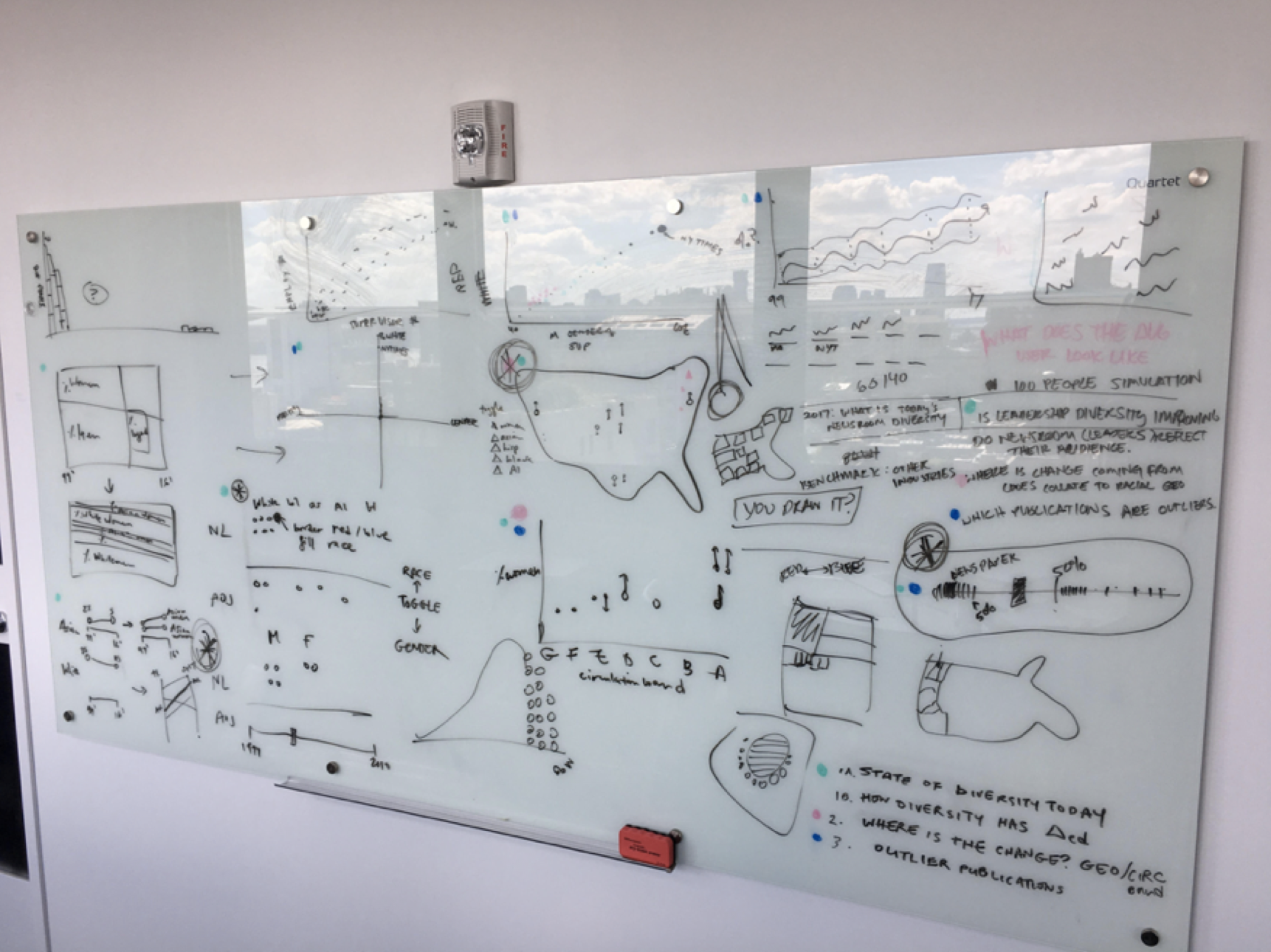
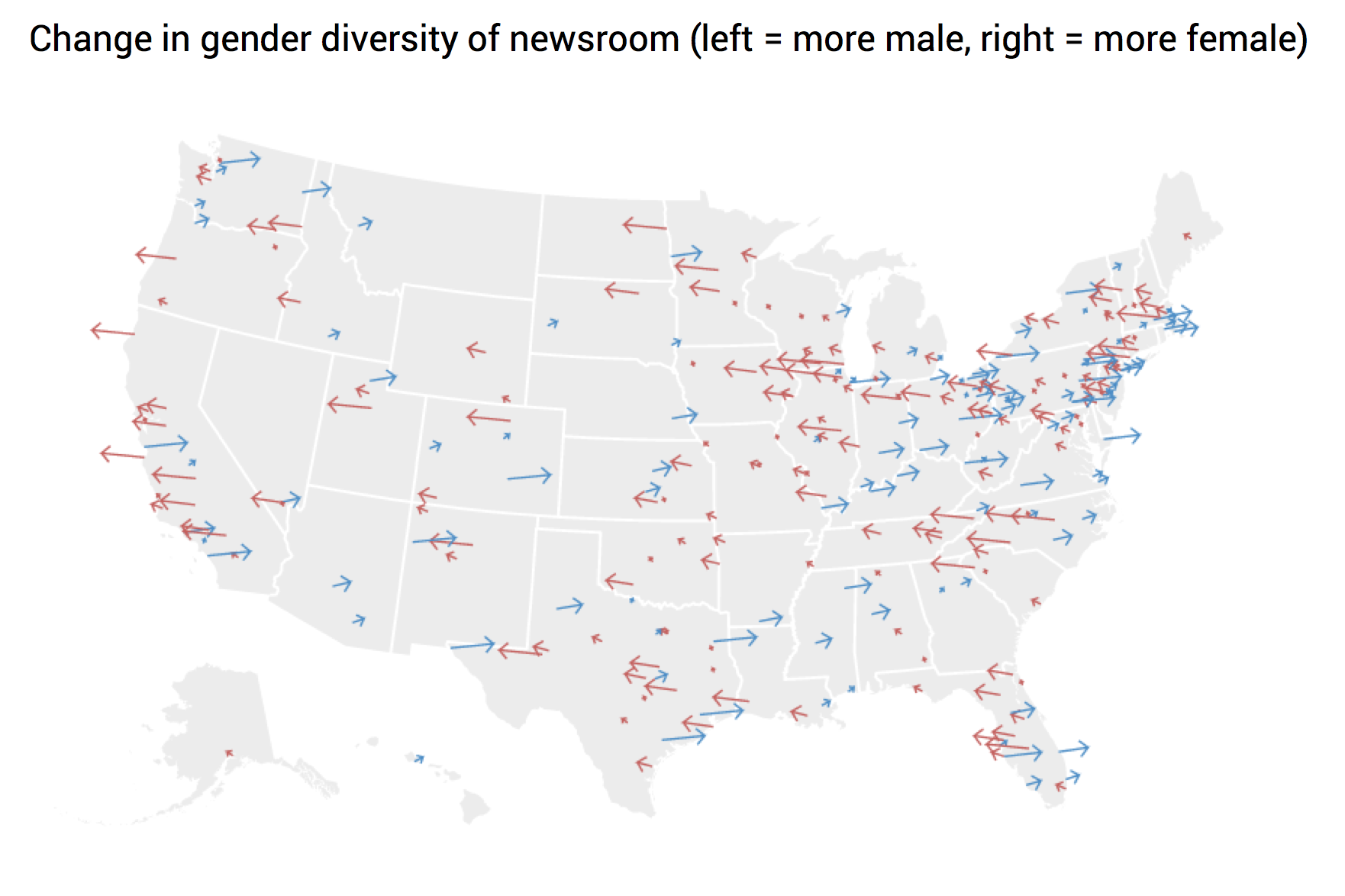
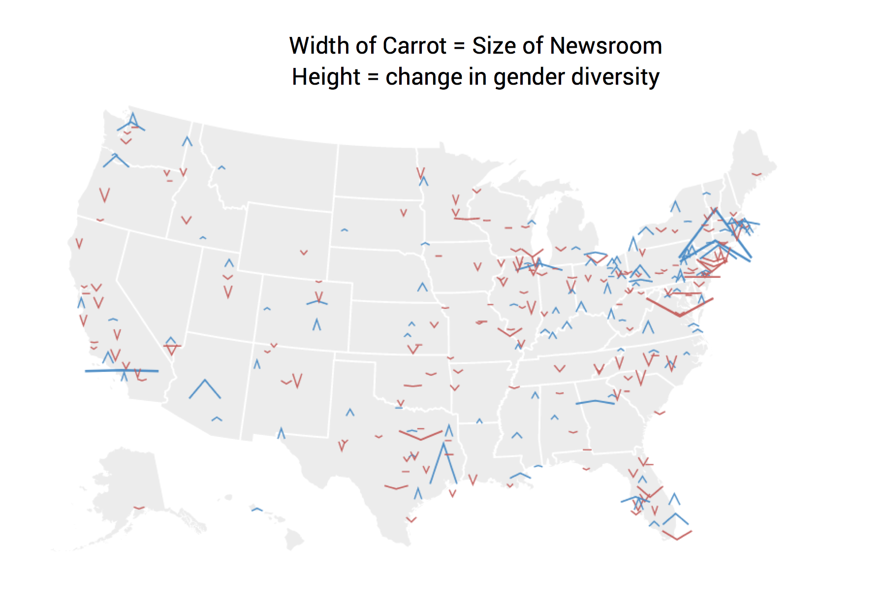
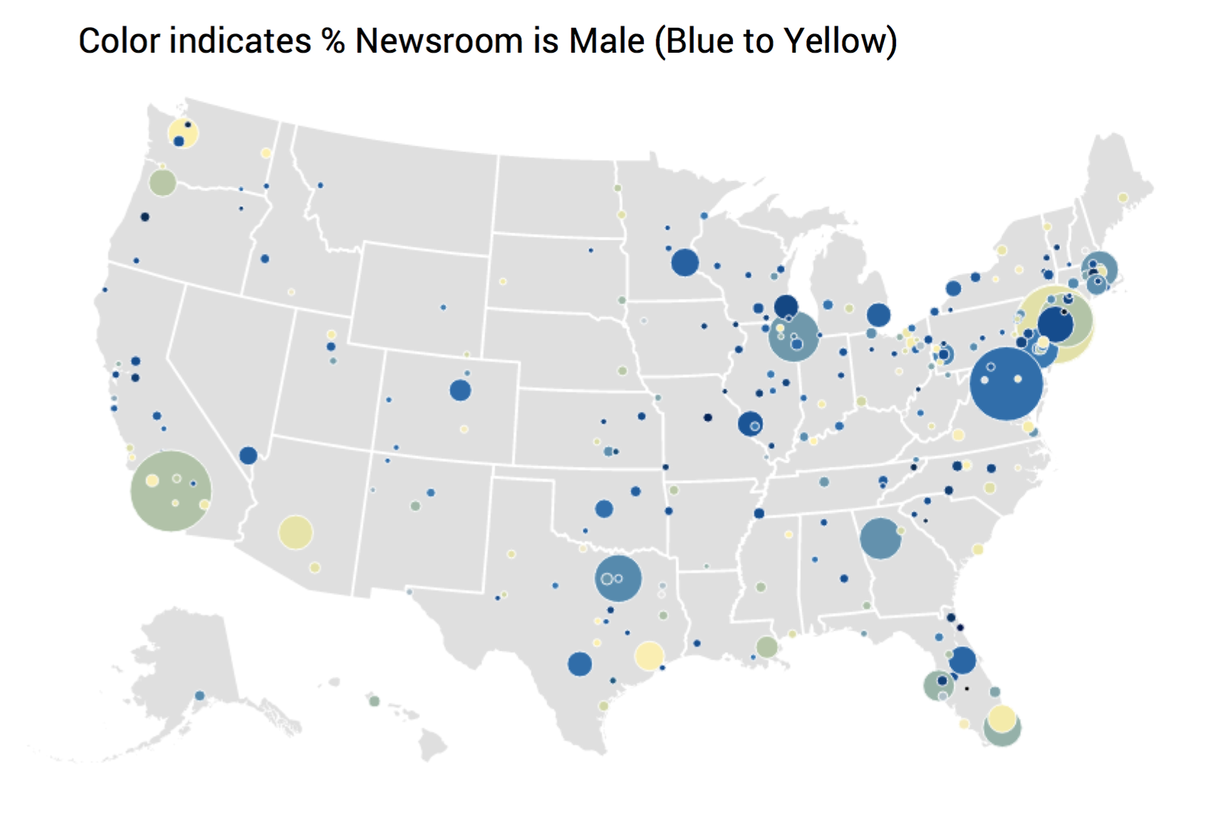
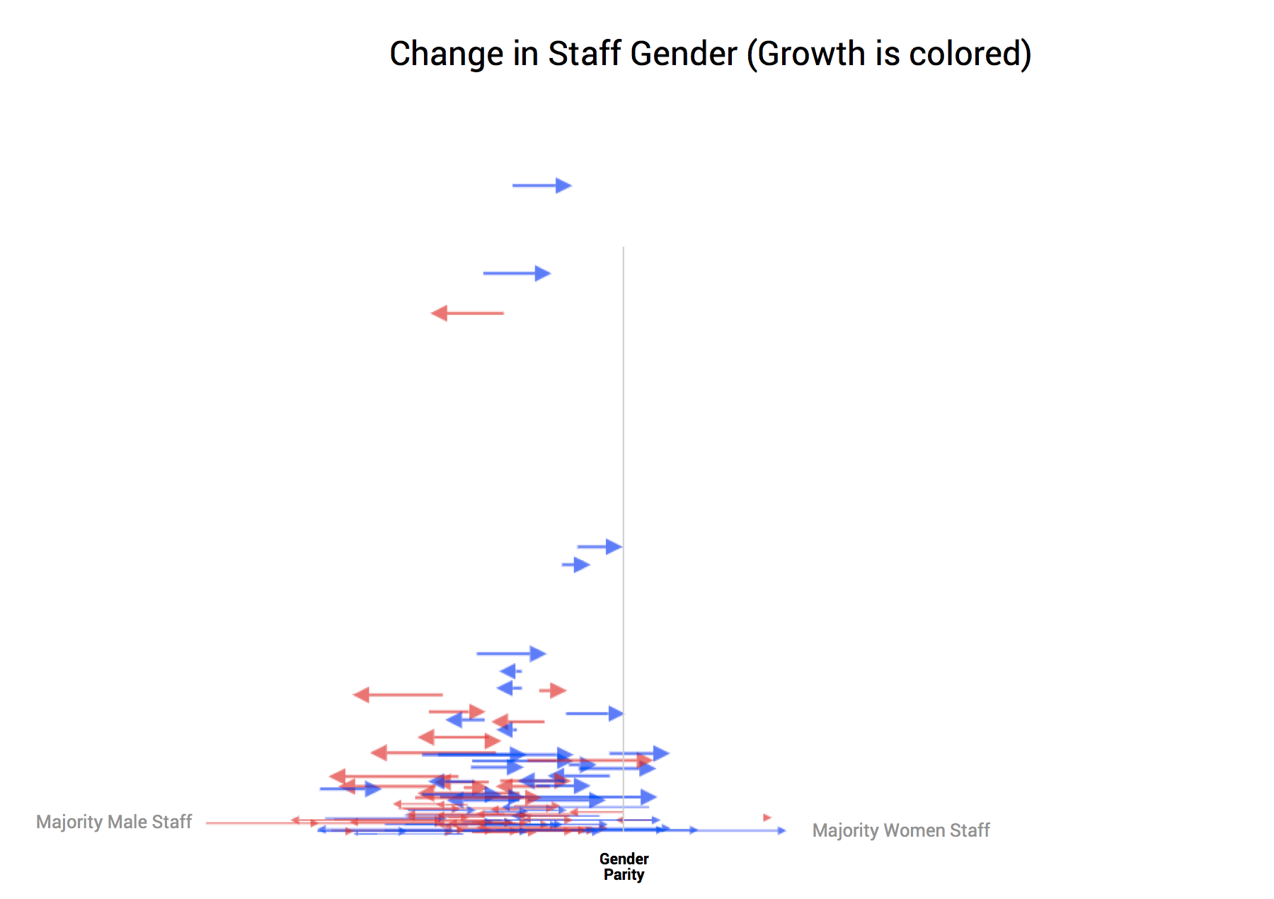
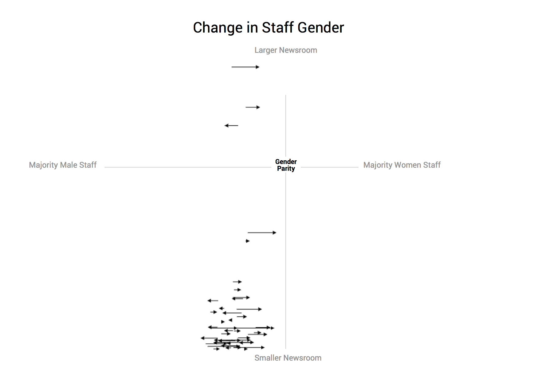
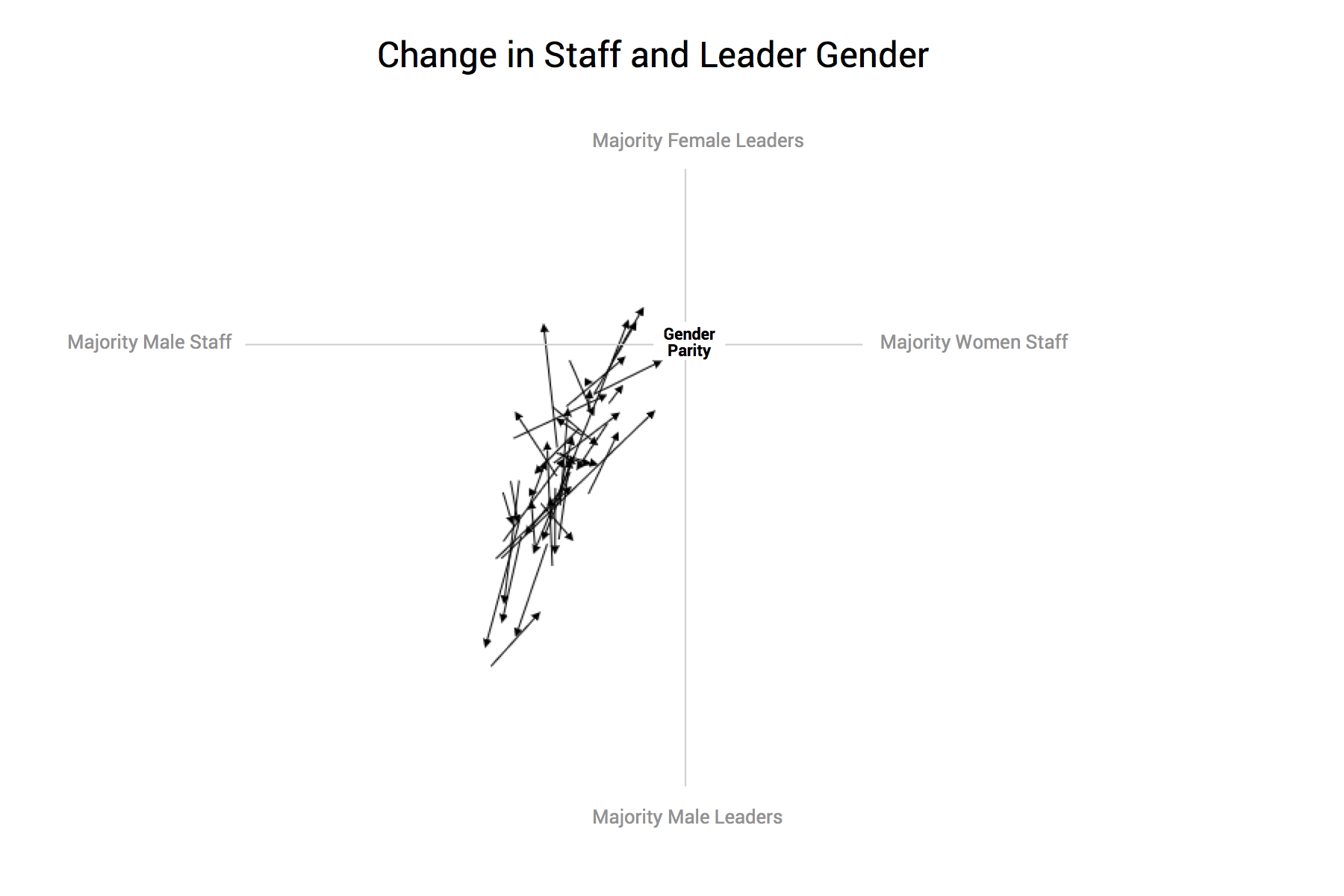
Our team has done the same. Consider Matt’s lengthy design process for our collaboration with Google News Lab, examining the diversity in US newsrooms (final project available here).
First, there was the initial whiteboard session:
After this, he created a multitude of different designs for the various sections of the project:
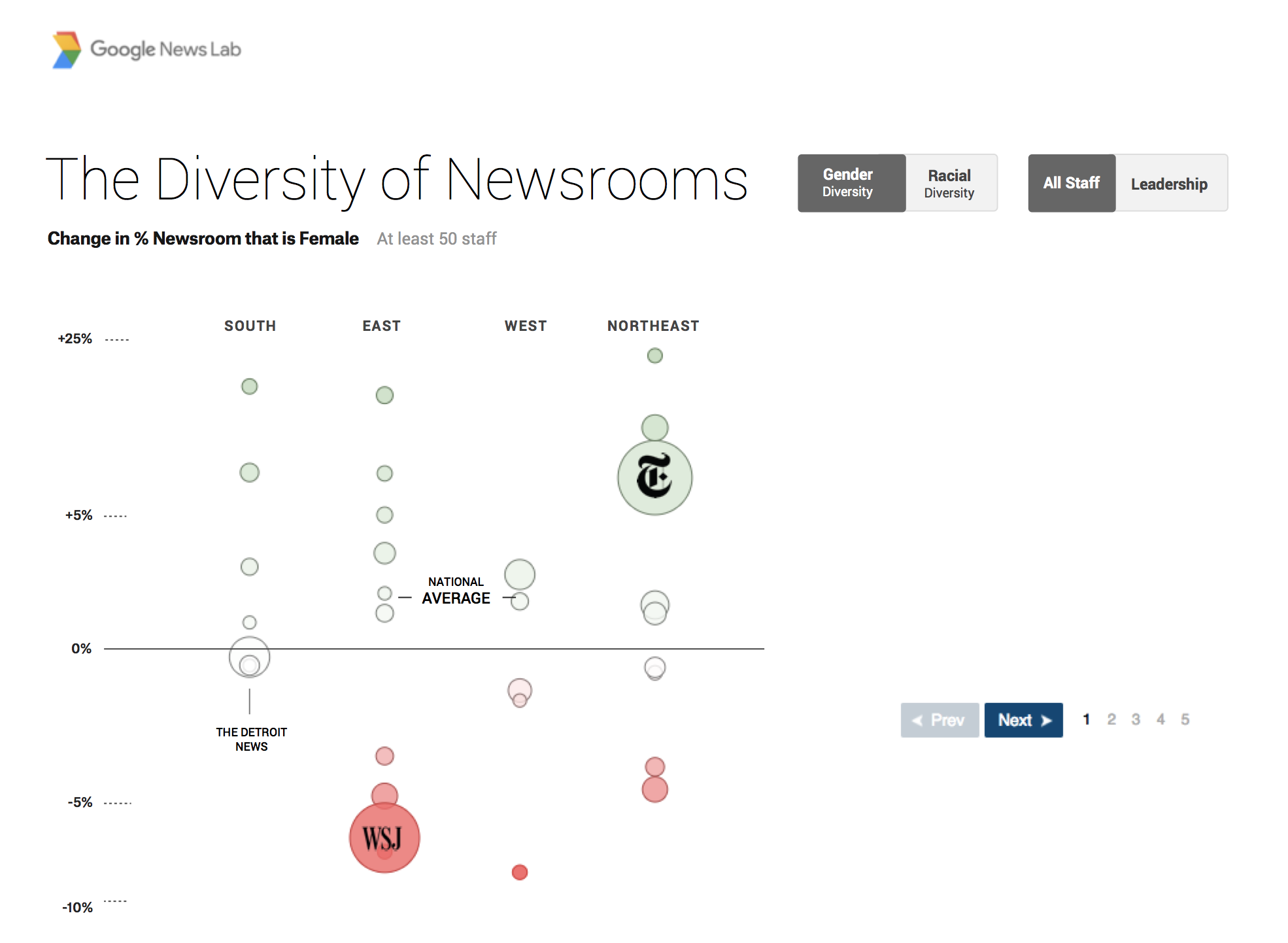
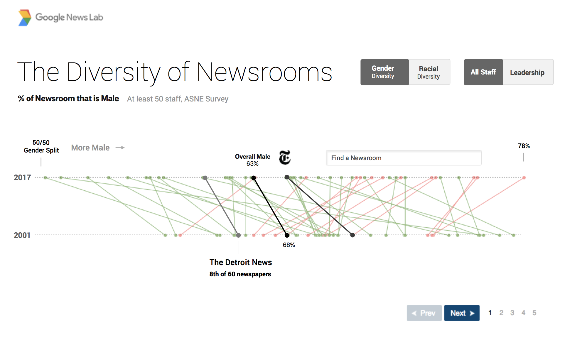
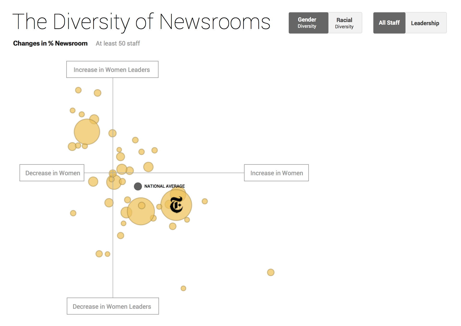
To see how the final version turned out, head here.
Finally, I’d like to leave you with a talk by Mike Bostock, who created the D3 library that we rely on so consistently to produce our visualizations, and who spent several years creating visualizations at the New York Times.
Here, he discusses the fact that designing visualizations is a matter of work. While good design may be an innate talent for a select few, most of us are in the same boat: quality work is a function of hours invested, rather than preternatural skill. Seeing the many iterations of Mike’s work is, to me, thoroughly heartening: if someone of his calibre tries a hundred different approaches to see what sticks, it’s a good signal to the rest of us to keep our noses to the grindstone.