The Pudding Cup
The best visual and data-driven stories of 2025
We’re excited to announce the winners of our ninth-annual Pudding Cup! Our judges selected these three projects from close to 100 entries. Each will receive $1,500 for their hard work.
The 2025 winners
Dithering — Part I
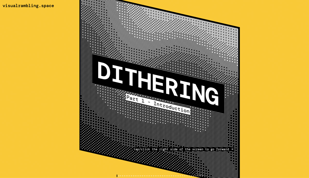
Not everything needs to be an interactive visual story. This piece, though, is an example of leveraging this medium to explain something more clearly (and more delightfully) than you could otherwise. The animations are super sleek, but more importantly, they make you say “oh, that makes sense.” Can’t wait for parts 2 and 3! —Michelle Pera-McGhee
The Legislative Network Behind State Trans Laws
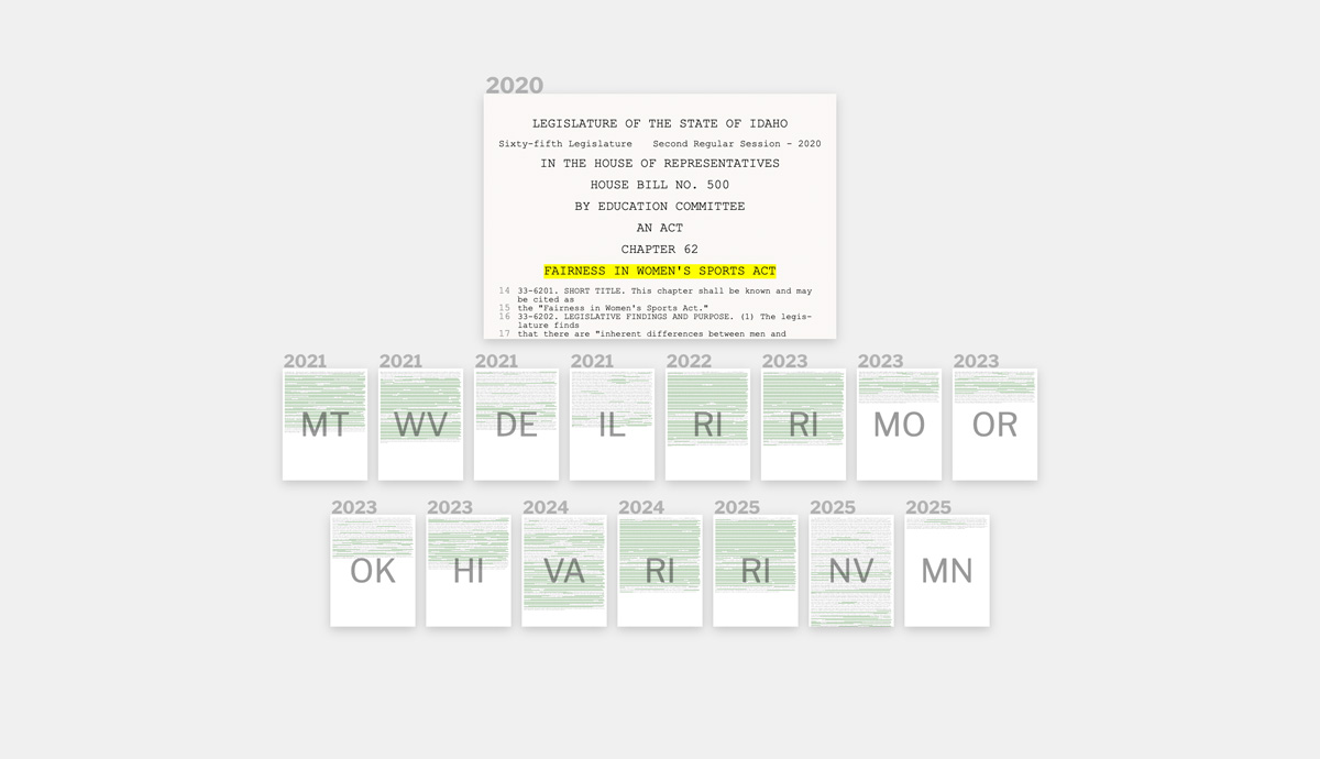
It's incredibly difficult to pull off a data story where your main visuals are text, but through animations and small multiples this piece delivers. A minimal document-based design hammers home the obsurdity that trans peoples' bodies and lives are being legislated with copy/paste. —Jan Diehm
Benford’s Law
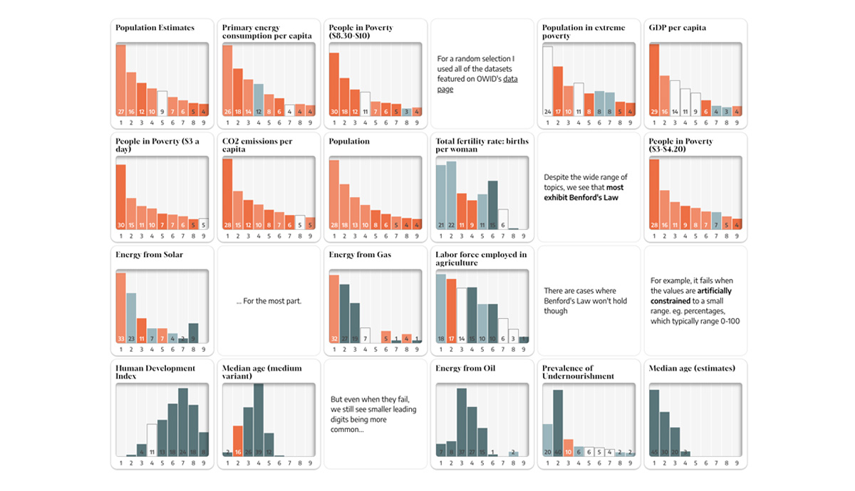
I've come across this topic before so I was excited to read it. What made it stand out was how thorough it felt. It kept answering the questions I had, provided tons of examples, and use simple yet effective visuals. —Russell Samora
See past winners from
The 2024 winners
Here's to the Next 100 Sudokus
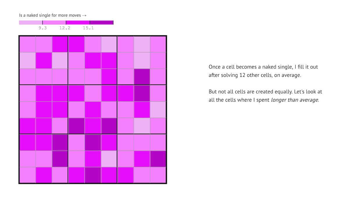
Talk about impactful journalism; since reading this story, I haven't missed the daily NYT sudoku. After an inventive data collection process and exhaustive analysis of his Sudoku career, author Vivek Rao leaves us with a timeless lesson — "Whatever life throws at you, take it one puzzle at a time, and one cell at a time."—Kevin Litman-Navarro
Votes in a Name
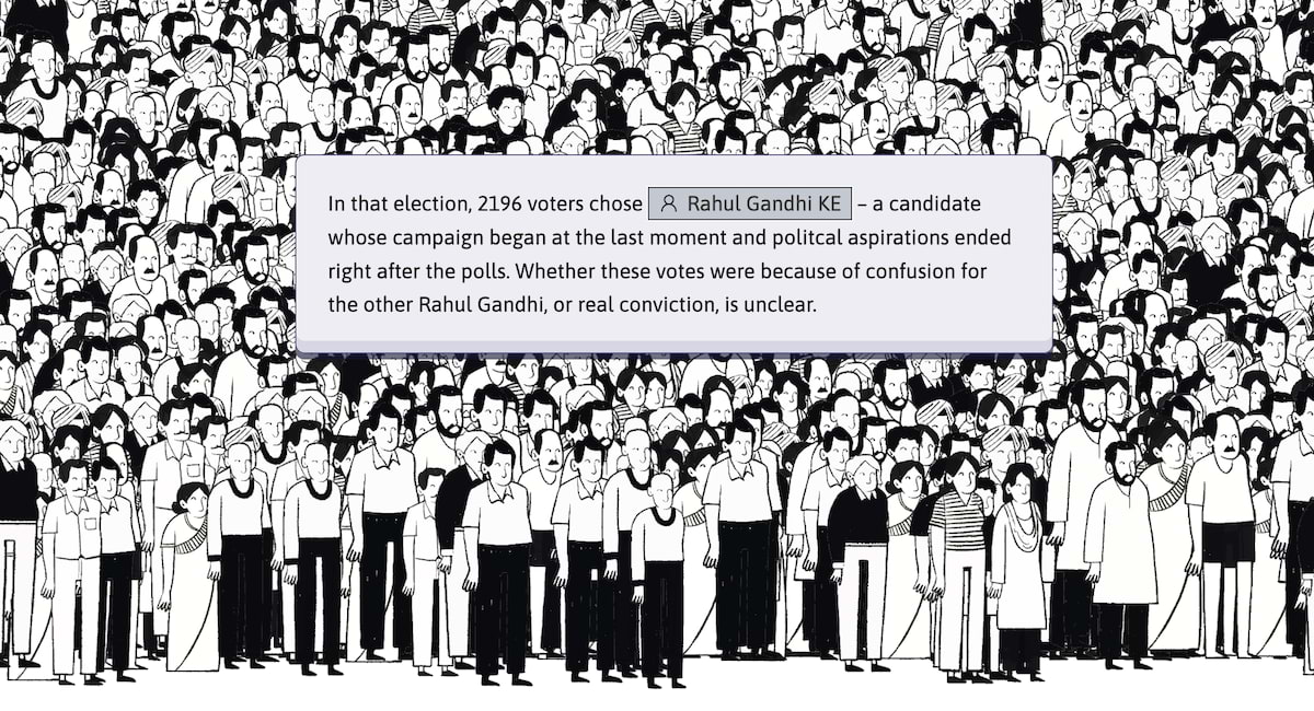
This story about name similarity and confusion while voting in Indian elections works well because of balance. It is a thorough exploration, yet holds the hand of someone unfamiliar with Indian politics. It has a nice blend of specific examples and expansive data. It is a visually pleasing experience that hits the right aesthetic tone for the topic.—Russell Samora
Battle of the Chocolate Bars
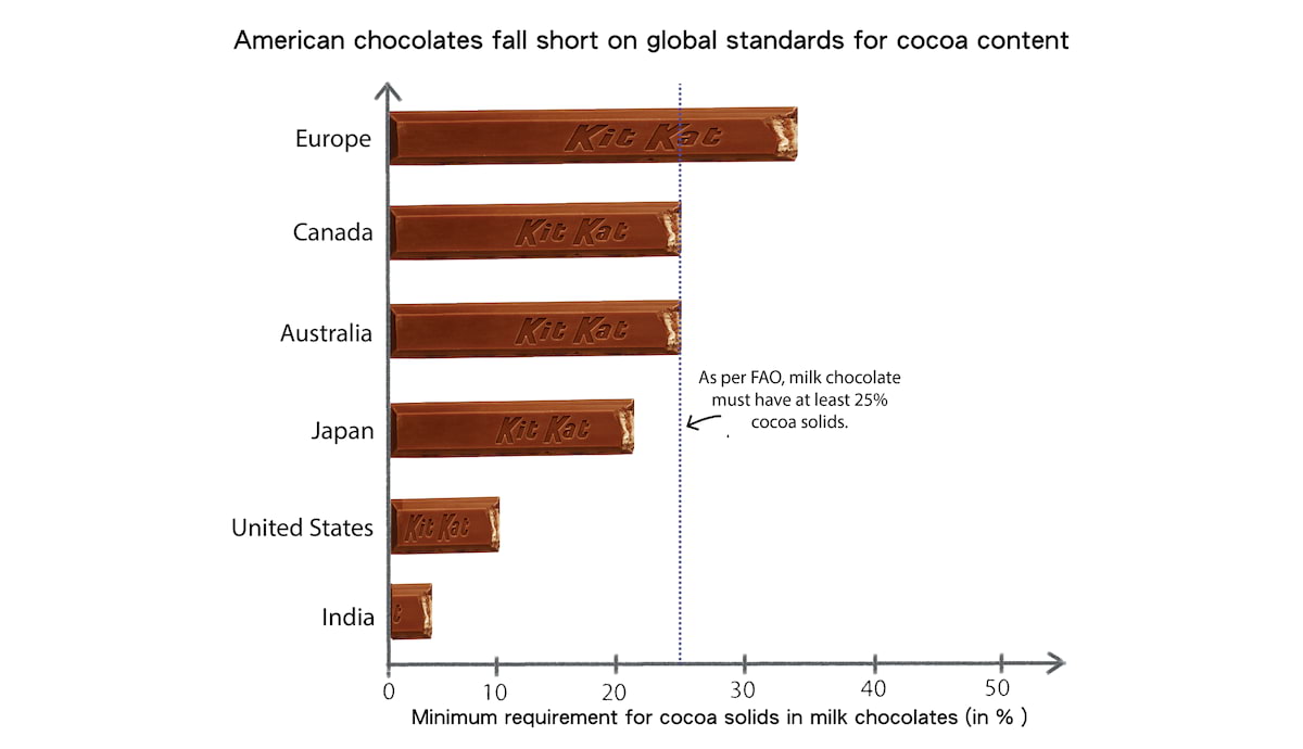
You may have heard that food is better in Europe, compared to the US. This is especially the case for chocolate. We really liked how this project broke down the differences between European and American chocolate standards, annotating ingredient lists and incorporating chocolate imagery into all of the charts. Moreover, readability wasn't lost when chocolate was used in the graphics, which often happens when deviating from typical chart shapes. —Matt Daniels